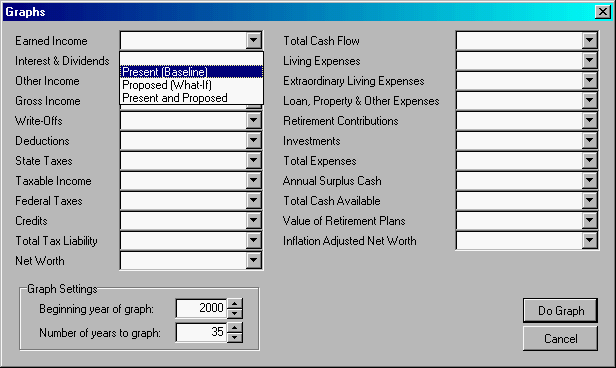
If you want to experiment with another way to create graphs in MasterPlan,
select Graphs from the Reports
Menu. MasterPlan projects both the present (baseline) and proposed (what-if)
scenarios.
You may select as many items as you wish. If you include too many items,
however, the graph will be very hard to interpret.
For each item on the list, you may include values from the projection
for the:
Base-Line (Present) Scenario
What-If (Proposed) Scenario, or
Both Present and Proposed Scenarios
Click on the beside the item
you want to include. For example, let’s graph the Net Worth for both the
Present and Proposed Situations. (In the window below, we clicked on Interest
& Dividends.)
Click on Present
and Proposed item in the drop-down list.
Select the Beginning
Year of Graph.
Select the Number
of Years to Graph. MasterPlan defaults to the number of years from
now to life expectancy for your client. Type 10
and press Tab.
Click on the Do
Graph button.
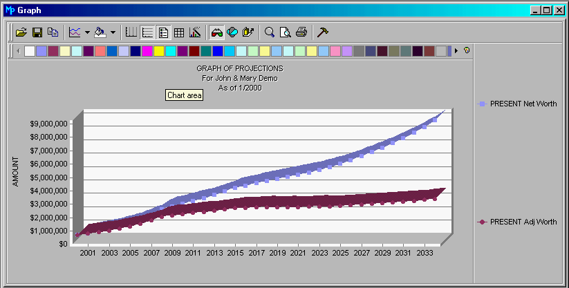
Now you can play with the graph. You might want
to click on the Properties icon
(the magic wand) beside the glasses with the red and green lenses. Click
on the Series Tab, and play with
different formats. You can select one series as a bar graph, and the other
one as a line graph, for example. The possibilities are almost endless.
Don’t
be afraid to experiment. If you get the graph looking too
wild, you can always close up the graph and reopen it with a fresh, clean
slate.
Note: The tool we are using to create the on-line help cannot
duplicate the colors on the graph, so both lines are showing as black.
We switched this graph from columns to lines, so you could see we were
graphing separate items. They show in beautiful, subtle colors on the
MasterPlan window.
When you have finished, return to the MasterPlan
Main Menu.
 beside the item
you want to include. For example, let’s graph the Net Worth for both the
Present and Proposed Situations. (In the window below, we clicked on Interest
& Dividends.)
beside the item
you want to include. For example, let’s graph the Net Worth for both the
Present and Proposed Situations. (In the window below, we clicked on Interest
& Dividends.)