As you work with MasterPlan's graphs, you will discover how powerful and flexible this tool is. You can change colors, change any of the labels, scaling, etc. You can also choose from a variety of graph formats.
To create a graph, go to the Reports Menu.
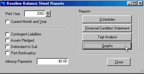
Many of the reports, such as the Balance Sheet window, have a graphs button. To generate the graphs associated with this report, click on the Graphs button.
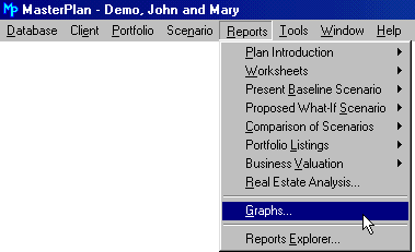
From the Main Menu, click on Reports | Graphs.
MasterPlan opens up a window displaying various items from the detailed present baseline and proposed what-if reports.
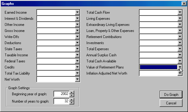
You may include as many items on a graph as you wish; however, if you choose too many items or items of too diverse a scale, the graph may not be as clear as you wish.
For example, if you include Earned Income (where the scale might be in the thousands) and Net Worth (where the scale might be in the millions) in the same graph, the Earned Income will be a tiny item compared to the Net Worth.
To select the item to graph, click on the
![]() beside the item. In the example above, we are going
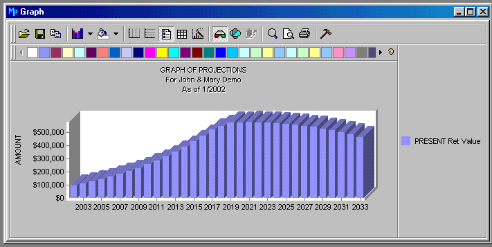
to graph the value of the retirement plans.
beside the item. In the example above, we are going
to graph the value of the retirement plans.
When you click on the down arrow, MasterPlan displays the following:
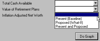
As this illustrates, you can graph the present situation, the proposed situation, or compare the present baseline with the proposed what-ifs in the same graph. We selected just the Present, by highlighting Present (Baseline).
MasterPlan displays the graph as illustrated below. The default is a column graph (bar chart) with the legend on the right-hand side of the graph.
Now you can begin to play with the graph to achieve just the result you wish.